Apartment Building Loan Rates Fall as Spreads Narrow

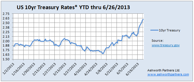
Back on June 24th I wrote a post Analysis on Tapering QE3 talking about how traders fears about the end of the Fed’s money printing spree made the interest rate on the 10 year Treasury jump. And as I mentioned in a follow up post Update on the 10yr Treasury rate we care about the 10yr Treasury (or T10) because it’s the benchmark most lenders base long term loan rates on. But there is one more component of apartment loan rates (and lending rates in general) that I want to draw your attention to. First an updated chart:

Treasury Rates and Apartment Building Loans

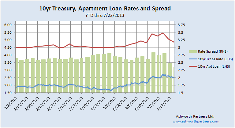
I’ve updated the chart with the latest rates and also added the rate for an apartment loan with a fixed rate for 10 years from one of our lenders (details on the loan terms below). The other thing I added was the spread, or difference, between the two rates (on the Right Hand Scale).  So far in 2013 the spread has averaged 2.65% or 265 basis points (bp) but it’s not a fixed amount that the lender adds to the T10. You can see that back in the beginning of May when the Treasury rate got as low as 1.66% the spread widened to 280bp because the loan rate was left at 4.5%. Then the spread narrowed back towards the average even while interest rates went up from there.

Then the Fed meeting notes came out in the middle of June and the T10 shot up but we got a double dose because the spread jumped up too. The Treasury went from 2.19% on the 17th to 2.57% on the 24th, and the spread jumped from 262pb to 283. It makes sense that in the uncertainty of a sudden rise in rates that lenders would widen their spreads to create a little breathing room but since then things have gotten quite interesting… in a good way. The good news is that since then the spread has Continue reading Apartment Building Loan Rates Fall as Spreads Narrow

Update on Recession Probability: Rough Seas Ahead?

Back in March I posted a FRED chart that Bill McBride over at Calculated Risk shared tracking a set of data that pretty reliably coincides with recessions. Even better is that in almost fifty years of data there have been only two false positives which brings us to a very interesting point. First, here’s the chart as it appeared when I posted back in March:

FRED Recession Probabilities March 2013
Looks like pretty smooth sailing since 2010

Next let’s look in more detail at those false positives:

FRED Recession Probabilities March Detail
FRED Recession Probabilities March 2013

This is what I like about this data series: Even if we set the bar as low as 5%, there have only been two instances Continue reading Update on Recession Probability: Rough Seas Ahead?

Job growth vs. revenue growth chart of top apartment building investment markets in the US- updated.

Back in February we posted an Axiometrics chart plotting the revenue growth vs. job growth in leading apartment investment markets in the US. They were out last week with an updated chart but not just in the way we might think since the numbers are Axiometrics’ 2013 forecasts for revenue and job growth updated through May this year. To me the real ‘update’ is that they reversed the axises on the chart and I think it makes more sense laid out this way:

Job Growth and Rent Growth for Apartment Building Investment
Click for full size image. Source: Axiometrics

Before I get sidetracked onto a long discussion on the importance of understanding just Continue reading Job growth vs. revenue growth chart of top apartment building investment markets in the US- updated.

Update on the 10yr Treasury rate which drives Multifamily, Commercial Real Estate and Home loan rates.

In the Analysis on Tapering QE3 post Tuesday I included a chart of the US 10 year Treasury rates and you could see them going vertical in the days since the Fed announcement and Bernanke’s press conference last week. We’re in the middle of negotiations on an apartment acquisition with a client and so what interest rates do over the next few days and weeks is extremely important to us. So here’s the updated chart:

10 year Treasury rate chart YTD 2013
Click for full size image. *Treasury Yield Curve Rates, commonly referred to as “Constant Maturity Treasury” rates, or CMTs. This method provides a yield for a 10 year maturity even if no outstanding security has exactly 10 years remaining to maturity. More at www.treasury.gov

We concentrate on the 10 year Treasury because that is the benchmark most lenders base their long term rates on. In order to lure investors away from Treasuries to buy mortgage bonds lenders have to Continue reading Update on the 10yr Treasury rate which drives Multifamily, Commercial Real Estate and Home loan rates.

Analysis on Tapering QE3 by Bill McBride- Not until December but #Multifamily rates jumped 45bp anyway

Bill McBride over at Calculated Risk stares at this stuff all day and has a pretty good track record reading the Fed’s tea leaves. He believes that actual ‘tapering’ of QE3 purchases most likely won’t start before December although there is a slight possibility that it could happen in September if…..

  • 3rd Qtr. GDP rose enough to make 2013 growth look like it will hit the low to mid 2% range.
  • Unemployment would have to dip enough to make it likely to get down to 7.2%-ish by year end.
  • Inflation has to be increasing. Currently the trend is in the wrong direction and Q1 produced only .3% which is well below the 2% annual the Fed Wants.

See Bill’s analysis here: Analysis on Tapering QE3 I highly recommend following Bill’s blog and this is just one of several posts in the last week on Fed comments around the end of tapering. Here’s the inflation chart he posted last week showing four different measures of inflation, note the trend since the beginning of the year:

US inflation measures 1990 to May 2013
Click on image to go to Calculated Risk article with chart.

Of course none of the Fed’s comments were interpreted this way by bond traders, what they heard was: It’s the end of the Continue reading Analysis on Tapering QE3 by Bill McBride- Not until December but #Multifamily rates jumped 45bp anyway

Apartment Building, Commercial and Residential Real Estate state of the market video from Tom Barrack of Colony.

Tom Barrack was on CNBC last week to talk about real estate with the traders. Great TB quote to open the show: “It’s always great to be the slowest guy on Fast Money”. There’s more wisdom in that statement than any of the show’s regulars understood.

A couple bullet points but definitely worth watching the video. The link on the image below goes to the Colony website where they edited the three segments together (commercial free too):

  • Housing [of all types] is the best opportunity. Today there might be a Fed bubble but there isn’t a housing bubble.
  • The rise in interest rates while not big and still low historically speaking, will hit entry level housing. 100bp (basis point, where 100bp = 1%) rise in interest rates will cost a borrower an extra $150+/- a month on their mortgage payment for a $200,000 home. That will keep more people renting.
Apartment Building Investment and single family
Click on the image to go to the Colony website video (no commercials)

Apartment absorption remains high while new unit construction picks up according to the SOMA report.

The NAHB (National Association of Home Builders) Eye on Housing out late last week included a chart of 5+ unit apartment building construction and absorption in the US. Built with the latest data from the Census Bureau’s SOMA (Survey of Market Absorption of Apartments, xls available here) is shows that absorption is holding in around 65% even while construction of new units is picking up:

Apartment building construction and absorption

The job growth isn’t distributed evenly across the US however. In the chart below from Axiometrics’ latest Jobs Report we can see which metros are Continue reading Apartment absorption remains high while new unit construction picks up according to the SOMA report.

The ‘Twin Peaks’ of Seattle Apartment Building Investment Plus MPF Research says rent growth holding strong there.

Friday twofer on Seattle. First is Dupre+Scott’s  entertaining and enlightening video on apartment building construction and property sales:

Mike has two nice charts showing apartment development numbers back to 1988 and sales volume back to 1981. Note that on the sales volume chart 2013 numbers are Continue reading The ‘Twin Peaks’ of Seattle Apartment Building Investment Plus MPF Research says rent growth holding strong there.

Employment recovery is better than we thought. Good for CRE and apartment building investment.

Interesting report from CBRE Econometric Advisors on the revised employment numbers just out from the Bureau of Labor Statistics’ (BLS). The BLS updates their employment numbers every year to reduce the error rate from their regular surveys and the revisions were up:

Employment Closer to Full Recovery, Good for Apartment Building Investment
Click for full size image.

It is important to understand that the employment data produced by the BLS are based on a survey and therefore are subject to sampling error. As part of its survey methodology, the BLS completes a re-benchmarking of its payroll employment data annually, to account for any job gains or losses that were missed over the course of the past year. The payroll survey consists of a sample of 145,000 businesses and government agencies covering 557,000 worksites throughout the U.S. The BLS uses a birth-death model to account for changes not directly reported in its sample due to business openings and closings.

In order to adjust for missing information that could cause the birth-death model to miss its mark, the BLS annually benches its estimates to unemployment compensation records, to allow for a reconciliation of total payroll employment. Although the largest changes are always seen in the most recent year or two, estimates as far back as five years may be measurably altered, which can have a significant effect on how the labor market is seen to have affected commercial real estate demand. The process is first done at the national level, and then at the state and local levels.

The upward revision shows that total employment growth the last two years was Continue reading Employment recovery is better than we thought. Good for CRE and apartment building investment.

Who is buying all those properties and what does it mean for the apartment building investment cycle?

Mark Hickey of CoStar put out a piece looking at who was responsible for the near record $65.8B of apartment building investment in 2012. CoStar’s numbers show that private owners/developers did just about half of all acquisitions last year and institutions were in for 12%, both near their recent trends. REITs on the other hand increased their share by a third, responsible for 12% of sales volume last year.

Interestingly the sellers were pretty much the same groups, except REITs who were the largest net buyers last year.

Apartment Building Investment by REITs 2004 to 2012

Last year REITs raised 15x the equity they did in 2008 (and 20x the total capital). Up against pockets that deep Continue reading Who is buying all those properties and what does it mean for the apartment building investment cycle?