Back in March I posted a FRED chart that Bill McBride over at Calculated Risk shared tracking a set of data that pretty reliably coincides with recessions. Even better is that in almost fifty years of data there have been only two false positives which brings us to a very interesting point. First, here’s the chart as it appeared when I posted back in March:
Looks like pretty smooth sailing since 2010
Next let’s look in more detail at those false positives:
Bill McBride over at Calculated Risk stares at this stuff all day and has a pretty good track record reading the Fed’s tea leaves. He believes that actual ‘tapering’ of QE3 purchases most likely won’t start before December although there is a slight possibility that it could happen in September if…..
3rd Qtr. GDP rose enough to make 2013 growth look like it will hit the low to mid 2% range.
Unemployment would have to dip enough to make it likely to get down to 7.2%-ish by year end.
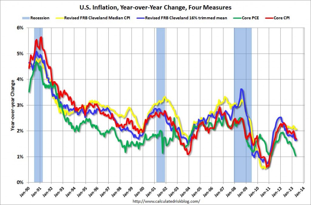
Inflation has to be increasing. Currently the trend is in the wrong direction and Q1 produced only .3% which is well below the 2% annual the Fed Wants.
See Bill’s analysis here: Analysis on Tapering QE3 I highly recommend following Bill’s blog and this is just one of several posts in the last week on Fed comments around the end of tapering. Here’s the inflation chart he posted last week showing four different measures of inflation, note the trend since the beginning of the year:
Click on image to go to Calculated Risk article with chart.
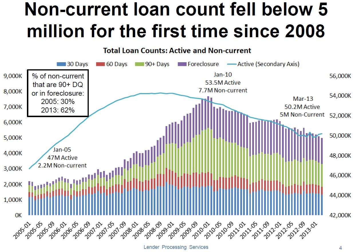
Bill McBride over at Calculated Risk has a post out this morning with 2 charts of data from LPS on the housing recovery. The first shows that homes in ‘active’ status, either in foreclosure, delinquent or otherwise ‘non-current’ has fallen below 2008 levels for the first time.
Which is the primary axis and which is the secondary is kind of a mystery and we are left to assume that both are x1,000 so that would imply the left axis is secondary (Or is it?) The most interesting factoid on the chart is in the box on the upper left; The percent of DQ homeowners active (in the foreclosure pipeline instead of being ignored) has doubled. To me this looks like a market that’s starting to clear, which is good for housing and the economy in general.
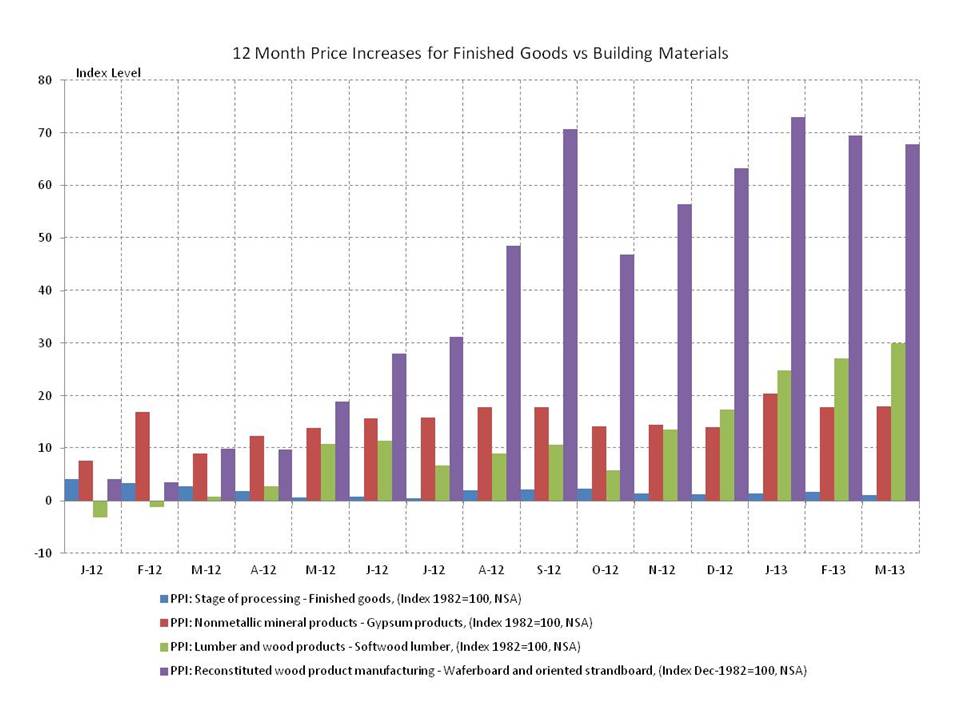
The NAHB has a piece out called Producer Prices in March – Building Materials Prices Approaching Housing Boom Highs talking about how far gypsum (main ingredient in drywall +18%), softwood lumber (2x4s, 2x6s, etc. +30%) and chipboard (oriented strand board and waferboard which have replaced plywood, joists and beams in many applications +68%) prices have risen in the last year, the chart tells the story: