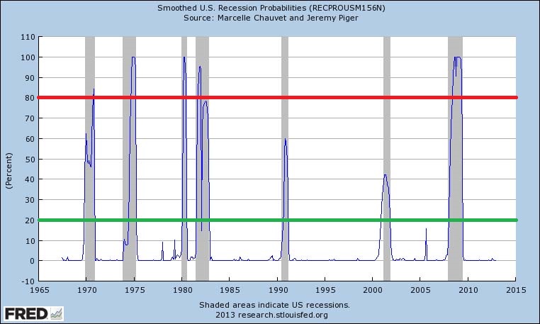
Quick link to a very interesting chart Bill McBride put up over at Calculated Risk:

The chart is from the St. Louis Fed’s Fred database which I’ve highlighted and you can find the original here. According to U of O Professor Jeremy Piger: “Historically, three consecutive Continue reading The Recession Probability Chart, A New Coincident Indicator?