Bill McBride over at Calculated Risk has a post out this morning with 2 charts of data from LPS on the housing recovery. The first shows that homes in ‘active’ status, either in foreclosure, delinquent or otherwise ‘non-current’ has fallen below 2008 levels for the first time.
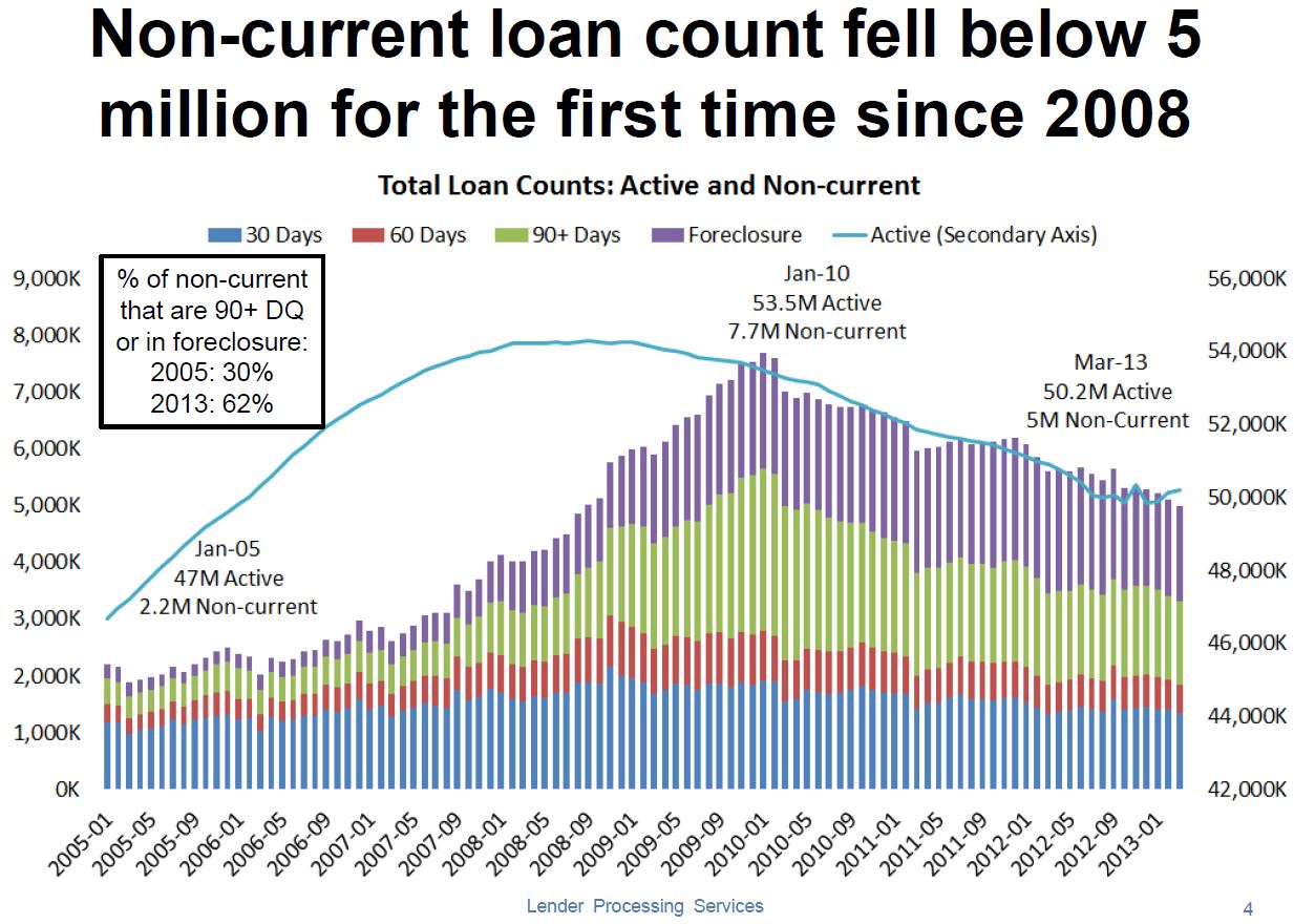
Which is the primary axis and which is the secondary is kind of a mystery and we are left to assume that both are x1,000 so that would imply the left axis is secondary (Or is it?) The most interesting factoid on the chart is in the box on the upper left; The percent of DQ homeowners active (in the foreclosure pipeline instead of being ignored) has doubled. To me this looks like a market that’s starting to clear, which is good for housing and the economy in general.
The next chart looks at the percent of Continue reading Housing recovering from the bottom up- good for apartment builidng investment? 2 charts via Calculated Risk Blog
