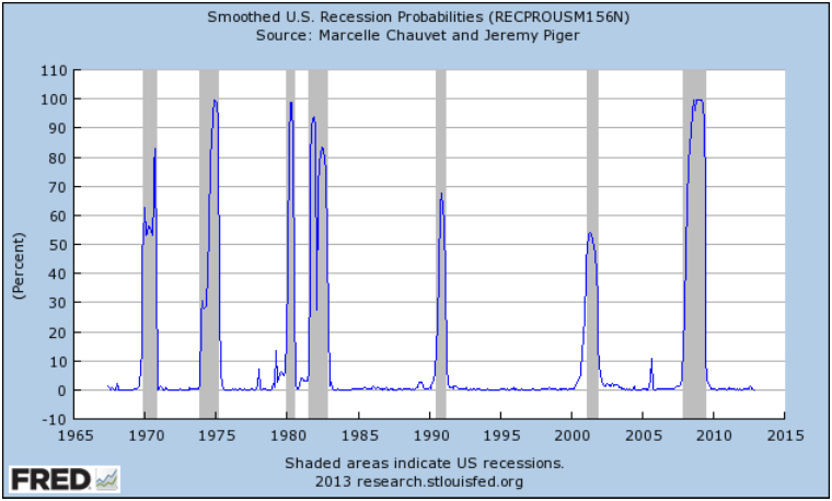
Back in March I posted a FRED chart that Bill McBride over at Calculated Risk shared tracking a set of data that pretty reliably coincides with recessions. Even better is that in almost fifty years of data there have been only two false positives which brings us to a very interesting point. First, here’s the chart as it appeared when I posted back in March:

Next let’s look in more detail at those false positives:

This is what I like about this data series: Even if we set the bar as low as 5%, there have only been two instances Continue reading Update on Recession Probability: Rough Seas Ahead?