Update on the 10yr Treasury rate which drives Multifamily, Commercial Real Estate and Home loan rates.

In the Analysis on Tapering QE3 post Tuesday I included a chart of the US 10 year Treasury rates and you could see them going vertical in the days since the Fed announcement and Bernanke’s press conference last week. We’re in the middle of negotiations on an apartment acquisition with a client and so what interest rates do over the next few days and weeks is extremely important to us. So here’s the updated chart:

10 year Treasury rate chart YTD 2013
Click for full size image. *Treasury Yield Curve Rates, commonly referred to as “Constant Maturity Treasury” rates, or CMTs. This method provides a yield for a 10 year maturity even if no outstanding security has exactly 10 years remaining to maturity. More at www.treasury.gov

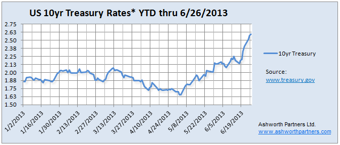
We concentrate on the 10 year Treasury because that is the benchmark most lenders base their long term rates on. In order to lure investors away from Treasuries to buy mortgage bonds lenders have to Continue reading Update on the 10yr Treasury rate which drives Multifamily, Commercial Real Estate and Home loan rates.

Analysis on Tapering QE3 by Bill McBride- Not until December but #Multifamily rates jumped 45bp anyway

Bill McBride over at Calculated Risk stares at this stuff all day and has a pretty good track record reading the Fed’s tea leaves. He believes that actual ‘tapering’ of QE3 purchases most likely won’t start before December although there is a slight possibility that it could happen in September if…..

  • 3rd Qtr. GDP rose enough to make 2013 growth look like it will hit the low to mid 2% range.
  • Unemployment would have to dip enough to make it likely to get down to 7.2%-ish by year end.
  • Inflation has to be increasing. Currently the trend is in the wrong direction and Q1 produced only .3% which is well below the 2% annual the Fed Wants.

See Bill’s analysis here: Analysis on Tapering QE3 I highly recommend following Bill’s blog and this is just one of several posts in the last week on Fed comments around the end of tapering. Here’s the inflation chart he posted last week showing four different measures of inflation, note the trend since the beginning of the year:

US inflation measures 1990 to May 2013
Click on image to go to Calculated Risk article with chart.

Of course none of the Fed’s comments were interpreted this way by bond traders, what they heard was: It’s the end of the Continue reading Analysis on Tapering QE3 by Bill McBride- Not until December but #Multifamily rates jumped 45bp anyway

What do I do with my retirement money, one investor’s answer (with charts). Think apartment building investment-

Good charts on long term returns in this piece from Glenn R Mueller, PhD.:

I recently met with my financial advisor to “rebalance” my … retirement portfolio. Based on my “age and stage of life” his allocation model showed a 50% bond allocation. I laughed and asked him if the company allocation model assumed interest rates would rise over the next 10 years? His answer was “yes- of course.” I showed him the graph below which shows lower than average TOTAL returns in a rising interest rate environment and he checked his long-term data and found that bond holders between 1953 and 1980 had actually lost money. We all know that as interest rates rise, bond values decline and thus the total return can be small or negative. Not to mention that a 10-year treasury at 1.5% is below expected inflation and thus a NEGATIVE REAL RETURN. He agreed that a bond allocation did not make much sense, but since my investor profile was conservative what was the alternative?

Apartment building investments outperform bonds in rising interest rate environments

Dr. Mueller is Continue reading What do I do with my retirement money, one investor’s answer (with charts). Think apartment building investment-