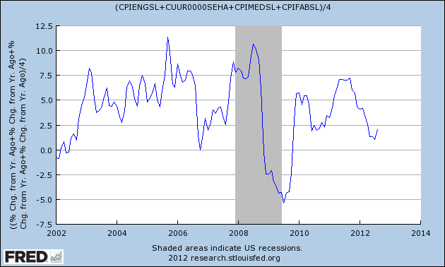
Yes the Fed is fighting DEflation but it sure doesn’t feel like deflation when we go to the store or pull up to the gas pump. While I am glad that Ben is battling the correct demon, it would be very helpful to know what ‘living inflation’ is doing to or for our apartment residents. Especially since on their National Apartment web conference earlier this week Reis said that in many of their largest 79 markets class B & C owners ability to raise rents has or soon will run into the 35% of income barrier. Watching what the costs of rent, food and beverages, energy and medical expenses are doing to our residents’ pocketbooks could guide us in raising rents. Today Pragmatic Capitalism had a very interesting piece on just that.
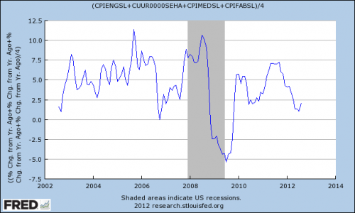
Right now ‘Family Inflation’ is in the 2% range but you can see that last year it was as high as 7% and that it’s quite volatile. Most of that feels like it could be from rising fuel costs but let’s take a look to see if we can find out what’s really going on. Using FRED (the Federal Reserve Economic Data) which is free, easy to use and doesn’t even require you to register, we will build our own series of charts so we can track and understand what’s going on with Family Inflation.
Go to http://research.stlouisfed.org/fred2/ and select the Data Tools tab and click on ‘Create Your Own Graphs’. Notice the other options on the list too, you can go mobile with FRED, build a map, download FRED data into a spreadsheet, and there’s even an API for feeding their data directly into your app.
Now you will be on a page with a blank graph, scroll down below the blank until you come to the Add Data Series area and the search box. In the box enter CPIENGSL which is FRED’s code for Consumer Price Index for All Urban Consumers: Energy. When you enter the code and click you will get a graph that goes all the way back to 1957 so to compare the energy component of Family Inflation to the chart above change the Observation Date Range to begin 2002-01-01. Also change the Units in the dropdown to ‘Percent Change from Year Ago’ so we’re comparing apples to apples and click the Redraw Graph button and your chart will look like this:
Wow look at that chart you just built, don’t you feel like a Nobel Prize winning economist now? Uh, sorry… pipe dream/nightmare over- Clearly energy costs are main driver of Family Inflation since the two charts look nearly identical. Let’s look at the other components in turn to see what else is going on.
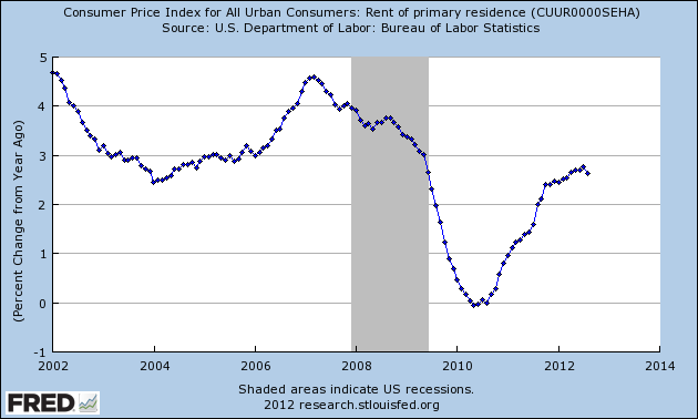
The great thing about FRED charts is that they have the codes for the components used listed on top and the Units listed on the left so let’s look at the second part, CUUR0000SEHA (those are four zeroes) the Consumer Price Index for All Urban Consumers: Rent of Primary Residence. Hit the Remove Line button (next to the Redraw Graph button) and enter CUUR0000SEHA. You will get a chart that goes all the way back to 1914 so once again change the begin date to 2012-01-01, change the Units to ‘Percent Change from Year Ago’, hit the Redraw Graph button and you will see this:
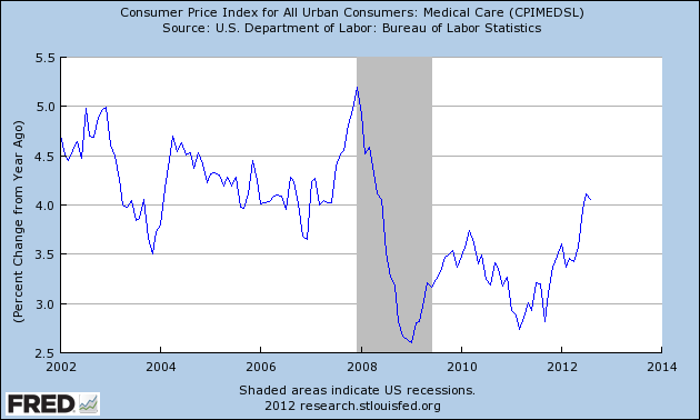
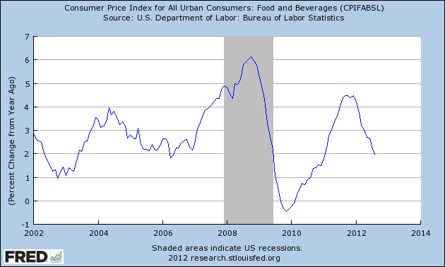
Rent growth, at least as the Bureau of Labor Statistics tracks it seems to be flattening (peaking?) a bit but still doing nicely in the mid to high 2% range. We can check the other two components of Family Inflation; CPIMEDSL (Medical Costs) and CPIFABSL (Food and Beverages) and get the following two charts:
Medical costs seem to jump around a bit but they’re leading the pack once again at over four percent up from last year. Note that even in the depths of the recession medical cost inflation never dipped below +2.5%. Food has been trending down this year it seems from over four percent to a low of 2% currently.
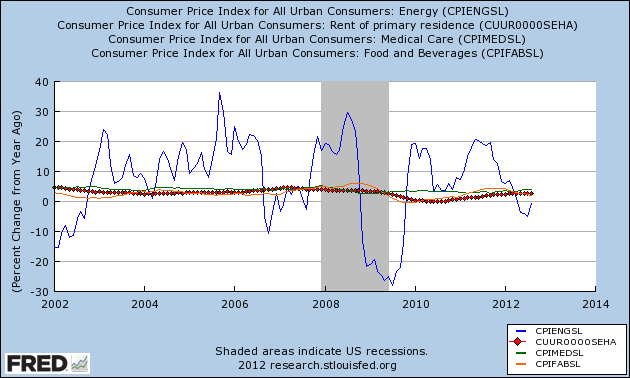
Now that we’ve looked at the components let’s build the complete Family Inflation Gauge chart. Hit Remove Line so we can start with a blank chart then enter the first code CPIENGSL, change the Start Date to 20012 and the Units to ‘Percent Change from Year Ago. Now scroll down and click on ‘Add Data Series’ (Below the Redraw Graph and Remove Line buttons). Enter the other three codes, CUUR0000SEHA (those are four zeroes), CPIMEDSL, CPIFABSL each time changing the Start Date and the Units so that all data sets are the same. Now we have a chart showing all the parts, clearly showing that energy costs are the big driver of Family Inflation.
That is a very worthwhile chart to track and if you register on FRED you can save your charts there and pull them with updated data whenever you need. To complete the circle though let’s create the final chart; the Family Inflation Gauge. To do that let’s start with a blank chart and add the first data series, Eneregy using the CPIENGSL code and changing the start date to 2012 and the Units to Percent Change from Last Year.
Now click on Add Data Series and this time select the ‘Line 1’ button instead of the default ‘New Line’ button at ‘To:’ Then enter the next code CUUR0000SEHA (remember four zeroes). Scroll down, hit Add Data Series and select the Line one button each time while adding the last two data series, CPIMEDSL and CPIFABSL.
In the ‘Create Your Own Data Transformation’ section click on the ‘Formula’ box and enter this formula: (a+b+c+d)/4 and hit ‘Redraw Graph’. Voila you are now on you way to Stockholm to accept your prize. Actually this is just the beginning of what you can do with the data on FRED and at a minimum you can decipher anyone else’s FRED chart.
It still feels like something is missing though…… what about education and childcare costs, they’re a big chunk a family’s budget. Let’s see what data FRED has that we can add to our Family Inflation Gauge. To look for a data series on education costs without having to rebuild the main chart again I opened a new browser tab and went to http://research.stlouisfed.org/fred2/ and selected the Data Tools tab and clicked on ‘Create Your Own Graphs’.
In the Add Data Series section next to the search box is the ‘Browse’ link, click on that and a new box will open up with a listing of all the categories FRED has data for. Scroll down to ‘Prices’ and select ‘Consumer Price Indexes’. Then select ‘Education and Communication’ from the bullet list at the top. Up pops ‘Consumer Price Index for All Urban Consumers: Tuition, other school fees, and childcare’ CUSR0000SEEB which seems to be what we’re looking for so I clicked on it and adjusted the start date and changed the units to ‘Percent Change from Last Year’. Wow, didn’t expect to see it falling like that although granted those costs are still going up at over 3.5% this year. To double check if this was really a good number to use I added the second Data Series in the Education and Communication category which is ‘Consumer Price Index for All Urban Consumers: Education’, CUUR0000SAE1. After adjusting the start date and the Units I got a chart like this:
Looking at these two education numbers the first (in blue) which includes childcare and is seasonally adjusted, and the second in red which does not include childcare and is not seasonally adjusted, seeing that they both track each other very closely I feel comfortable using the first number in our Family Inflation Gauge.
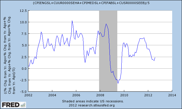
I went back to the other tab, the one with the Family Inflation Gauge charted and added the Data Set CUSR0000SEEB, selected Line 1 and changed the Formula to (a+b+c+d+e)/5 to get our final Family Inflation Gauge chart:
Not that different from the one Pragmatic Capitalism produced but I feel confident it captures all the major inflation components facing American families and that by tracking this gauge along with the five components separately I will have a good sense of what inflation is doing to our apartment residents…. and to my own wallet. If you feel different data sets or fewer data sets or using different Units of measurement work better by all means create your own graphs, that’s the beauty of FRED, you can drill down into the numbers that count for you.
Allergic to numbers? No time to build your own chart? Believe the Fed is part of the Illuminati? Go to our Contact Page and send us a message with “Family Inflation Gauge” in the subject line and we’ll send you a PDF of the current chart, Plus a new one every quarter until you tell us to stop, we drop dead or Ron Paul succeeds in killing off the Fed, whichever comes first.

