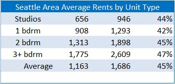
A piece on Seattle apartment building rents over the last ten years by Matt Goyer in his Urbnlivn blog really caught my eye. Matt looked at data from seattlerentals.com for four popular sub-markets and charted them out here. Naturally I wanted to see what that meant percentage-wise so I built a spreadsheet and added a percent change column. Here’s what that looks like:

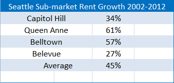
All within a stone’s throw of 45% growth in 10 years, not bad at about 3.8% annual compound rent growth. But let’s slice the data another way and look at the rent growth by sub-market:
Now we start to see some divergence with Queen Ann at 61% (4.86% compound) and Belltown with 57% (4.59%). Where the ‘average’ rent growth really looks good is when it’s compared to Capitol Hill with only 34% (3.01%) and in Bellevue with only 30% (2.42%). Mind you that is just the ‘average’ 10 year rent growth for these markets so it’s only an indication of what any particular property may have achieved. But here’s where the numbers get really interesting:
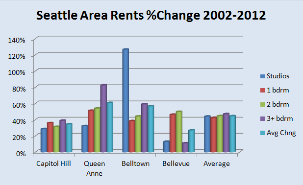
If we slice them up by Sub-market and Unit Type some things really jump off the page. The differences between unit types in different sub-markets and therefore ideal unit mixes are really important in how properties performed over the last 10 years:
Capitol Hill seems to be the only sub-market with fairly even rent growth across all unit types but it was definitely good to own studios in Belltown and 3+ bedrooms on Queen Anne while you surely wanted to stay away from those two unit types if you were in Bellevue.
I know a lot of apartment building investors who like one unit mix or another but how does that play out in your markets?

