Seattle’s Strange Trip Through the Apartment Building Investment Cycle Part II
In part I we saw that some of the most widely followed market cycle research can’t be relied on without question. If knowing where we are in the market cycle is the most important thing (and not everyone agrees, see the comments from one of my private equity guys about that under part I here) then the best solution is probably to chart the cycles for the markets we’re investing in ourselves. If you’re in multiple CRE sectors in a lot of markets hopefully you have someone on your team or can hire a consultant (like Ashworth) to chart those cycles.
Building our own CRE market cycle chart
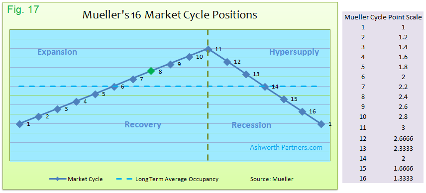
To track a cycle for one market and sector we only need to answer five questions according to Professor Mueller’s methodology: Market occupancy, the 30 year Long Term Average (LTA) occupancy, rent growth, inflation and new unit construction. Later we’ll look at whether we can get by with fewer than five but for now let’s stick with Mueller. Using his explanation that’s on page two of every Cycle Monitor report (see Figs 7 & 8 in part I) I assembled this handy cheat sheet:
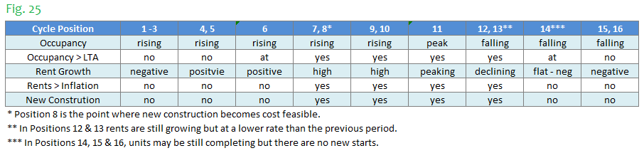
Now we just need to answer the five questions and determine the market cycle position:
- What is occupancy compared to the last period?
- Is occupancy above or below the LTA?
- What are rents doing?
- Are rents growing faster than inflation?
- Are there new construction starts?
You can see on the cheat sheet that in all but 6, 11 and 14, multiple cycle positions share each set of answers. In the case of 1-3 I would say that position 1 is when occupancy first flattens out, and 3 is when rent growth is pretty close to turning positive. The other groups are probably a judgment call based on how close the market seems to be to moving onto the next position or group.
Interestingly Mueller thinks markets can move backward through the cycle and I buy that could shift around in a position group or that noisy data could make it appear to go backwards but it defies the whole concept of a cycle. I am much more inclined to go with Howard Marks’ (of Oaktree Capital) description of them; “The events in a cycle not only follow the one preceding it but are a result of the one preceding it.”
Now Dr. Mueller’s model, like most all models, models a fairly perfect world where things happen pretty much the way they’re supposed to but as we saw in part I our markets (or at least the ones I’ve been in) never seem to operate in that perfect world. Specifically in the case of the Seattle apartment market there’s never been ‘no new construction’ in the last thirty years yet that market has definitely gone through cycles.
What to do when the signals conflict? I believe the answer is to always have the possession arrow pointing at occupancy (or vacancy if that’s the way you roll). Fundamentally the market cycle position can’t be in opposition to occupancy and we’ll look at that in more detail shortly.
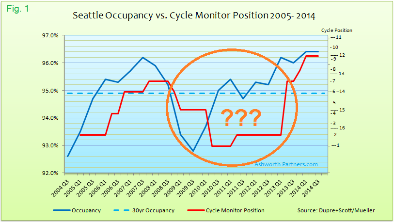
Here’s a sample chart that will allow us to walk through the process of charting a cycle:
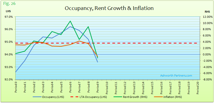
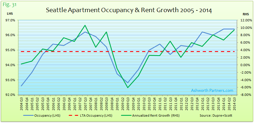
The blue line is occupancy, the dashed red is the 30yr LTA occupancy and both use the Left Hand Scale (LHS). The green is rent change, orange is inflation, both using the RHS. Keep in mind that rent growth can fall from one period to another but still be positive; note the heavier grid line at 0% rent growth on the RHS. For example rent growth fell significantly in period 7 but was still at 5% positive, a number most of us would be quite happy with as an average.
Using the cheat sheet and the chart above here’s how I answered the five questions for the first nine periods along with the cycle position that resulted:
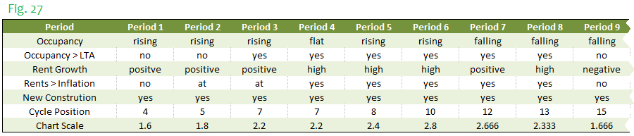
The idea of blanking out the chart beyond the period being analyzed is to avoid being influenced by what happens later, similar to selecting the cycle position in real time for the most recent period without any advanced knowledge from the future. If you do have advanced knowledge from the future we should talk. The last line on Fig. 27 is the actual chart scale position from the table I used to model the Cycle Monitor chart:
Here’s what that looks like:
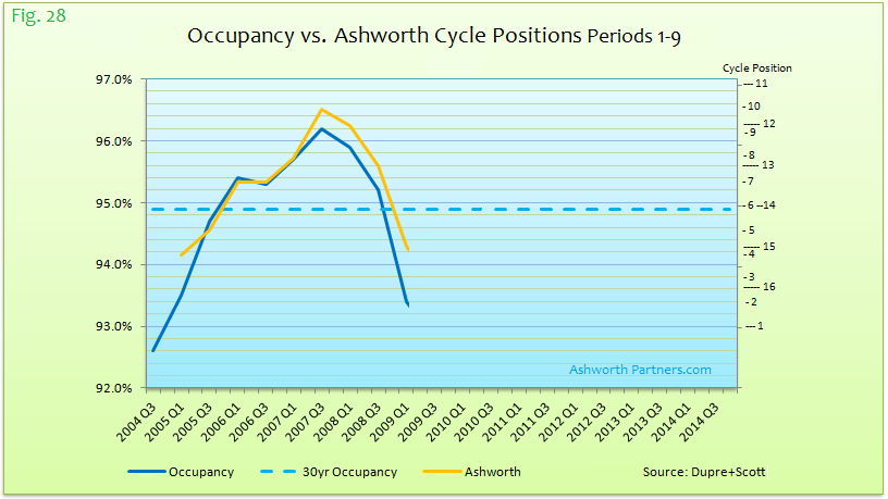
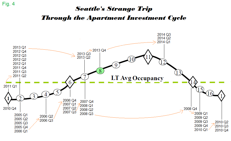
Looks like things have fallen off a cliff with the cycle at position 15 and only two more spots to go until absolute bottom. Turns out the world didn’t end (although it came close), things turned around and the whole chart which is Seattle looks like this:
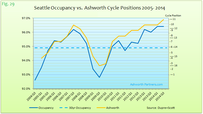
As I said in Part I, I believe Seattle’s apartment market is peaking but wouldn’t argue with any placement from 10 to 13. The tops are very hard to call and besides Amazon (or Elon Musk) could keep taking down another million square feet of office space at a pop, creating room for another 1,000 employees so the market could be peaking for ‘an extended period’ to use Fedspeak.
Maybe this is Seattle’s ‘new normal’, county-wide there’s been 50k new jobs every year for the last three. On the other hand Seattle will be delivering even more units in 2015 (12k) than last year (8.4k) and even more in 2016 (13k). Eventually something has to give and when we see occupancy turn down two periods in a row the peak will be passing.
If all this charting looks like work (and it is) imagine updating 250 markets/sectors every quarter like Professor Mueller has to and I for one have a bit of sympathy. However his lack of graduate students or interns doesn’t help us decide when to be buying or selling. When it comes to the Seattle apartment market at least Who you going to call? Since 555-2368 hasn’t worked since Egon Spengler died a year ago (R.I.P. Harold Ramis) I say Ashworth Partners:
Lessons Learned
Lesson 1 is don’t depend on others for critical information unless you double check it- Trust But Verify as the Gipper said.
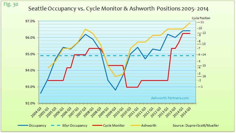
Lesson 2 is that tracking that information over time is a very good way to spot when things are starting to go off the rails. When I first noticed that the Cycle Monitor and the actual Seattle apartment market weren’t tracking I started keeping score with this chart:
Later I went to building the Excel charts like Fig. 30 (above).
Lesson 3: Occupancy drives everything. Looking at Fig. 29 again the cycle pretty closely tracks occupancy, as does rent growth which makes intuitive sense:
If occupancy is rising rent bumps are coming; if it’s falling rent growth will be stalling and if it continues concessions are on the way. This is one instance where supply and demand from Econ 101 work exactly like they do in theory. So lacking any other information tracking occupancy should give a good approximation of the cycle. Understanding the state of rent growth and new construction gives indications of where the cycle is headed however. I think that Mueller’s Position 8 is especially important; the point where new construction starts to pencil. That’s typically when existing properties start to sell at or near replacement cost; I call it the Line of Doom. Not that it’s the end of the cycle or that value add/repositioning deals won’t work just that there’s about to be a bunch newer, shinier competition coming that anything you do acquire at this point will be facing.
If you have a market you’d like to see charted reach out through our Contact page and we’ll get to work on building a cycle chart for you.

Great things to keep in mind here. Thanks for all of these graphs, too – it’s always great to be able to visualize how the market is doing.